|
For those not painfully familiar with the bizarre array of ingredients in the global mean temperature bowl the "straight from the box" components are these: From the National Climatic Data Center there are two stock varieties -- departures from the 1961-1990 average and departures from the 20th century average (1901-2000). The joint effort from the Hadley Centre and UEA Climate Research Unit (HadCRUT3) comes as anomalies with reference to the period 1961-1990. The Goddard Institute for Space Studies (a.k.a. "The House of Hansen") prefers to render the GISTEMP series as variation from the 1951-1980 mean. Unfortunately, neither the HadAT radiosonde balloon record nor the UAH Microwave Sounding Unit series are sufficiently long that we can derive Twentieth Century or 30-year means dating from mid-century. Although far from global the Central England Temperature series is conveniently provided as absolute temperatures and is also one of the longest continuous records available, as such it makes a useful comparator and we'll be using it as a benchmark of sorts so you can see how the other records fit into the picture. In addition we'll provide paired plots of the other series so you can see how they compare. Having suffered through the experience of comparing the various presentations more times than we care to remember we've decided to make your life somewhat easier by converting all records to anomalies from a common reference period. The following series have been adjusted to suit the only period they can all agree on -- the twenty-year average 1979-1998 (selected so we can include the satellite data series). 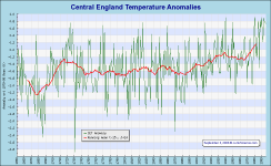 We've chosen to start with the Central England Temperature series for no other reason than it has some length and therefore perspective to help iron out short-term quirks and anomalies.
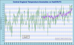
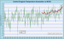
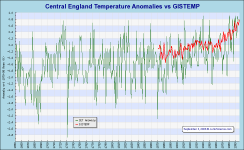
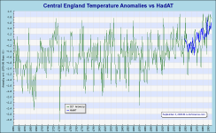
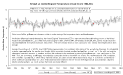
Due to the localized nature of the series it demonstrates somewhat frantic variation. To help make trends easier to observe we have added a 30-year running mean (the average of year minus 15 through year plus 14). Certainly the warming around the end of the Seventeenth and early Eighteenth Centuries would seem significant (and probably a huge relief from the cold of the Little Ice Age) -- it's probably the most significant feature of the graphic.
Whether the warming is all genuine is uncertain since Armagh Observatory displays a somewhat smaller trend. Unfortunately, Armagh doesn't seem to have a regularly updated service so we haven't tried to include it in the suite under consideration here. It's a shame because Armagh is a highly desirable set specifically because it is less subject to UHI than are many recording points.
We haven't applied any smoothing but obviously global temperatures are not as subject to local influences and this bears a fair resemblance to our smoothed series above. This could be significant in that it suggests the longer CET series might make a kind of global temperature proxy. If true, the longer perspective tends to reduce the apparent significance of recently observed warming as a relatively minor perturbation in a short record.
This is a point that seems to cause significant confusion among readers, at least those literal souls who seem to expect measured temperature to be both precise and accurate -- we wish. It is true that everyone assembling near-surface temperature measures and attempting to derive a global mean has a limited pool of recording stations available. It is probably not unreasonable to expect virtually identical numbers to be obtained but this is not likely to happen any time soon. "Mileage varies", as they say, because each group has their own favored set of sites they include in their record composite and their own methods of dealing with confounding factors such as the Urban Heat Island effect.
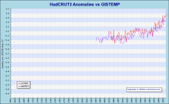
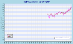
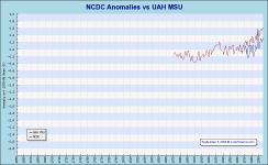
1200Km (750mi) from the nearest recording point means the equivalent of taking the temperature in New York, New York, with a thermometer in Atlanta, Georgia. Good luck with that but we suspect this has much to do with GISTEMP being the anomalously warm series of the suite. For those who don't see the difference between GISTEMP and the preceding NCDC we'll be providing direct comparison shortly.
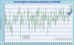
This series gives the impression of being rather more reactive than the global near-surface amalgams with a record amplitude nearer that of CET than the globals (although still somewhat smaller) and seemingly having a very similar trend.
Although this series is terribly short, 1979 through 2005, it has certain advantages over the near-surface and even the radiosonde balloon data. Why favor a pitifully short series over much longer ones? It's that "confounding factor" thing again. Partly because we now have virtually global weather satellite coverage there has been a progressive closure of remote meteorological stations. After all, there's no need to require and maintain people in the middle of nowhere if you can get real-time data remotely at less cost and without potentially putting people at risk. The downside of this from a global temperature-taking perspective is that rural records are declining and urban records are being gathered in increasingly developed and built-in regions. Add to this the somewhat ambitious, if not outright imaginative attempts to extrapolate temperatures 1200km away and we're left with somewhat dubious global temperature data and trends which may, or may not, be genuine.
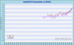
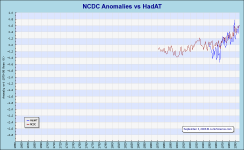
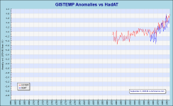
These two are quite similar with the longer HadCRUT generally cooler.
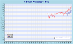
We have been asked whether we have something of a set against GISTEMP and inquiry about bias is not unreasonable. It is quite true that we find GISTEMP the least credible of available datasets and this is not merely due to their questionable extrapolation practices. All datasets claim to try to eliminate or reduce UHI as a corrupting influence and this invariably involves downward adjustment over time as urban building adds a warming bias at a given recording point. Whether this is sufficient is as yet unclear but general indications suggest not -- witness the CET/Armagh comparison above. Just as everyone is trying to down-revise faux warming the House of Hansen is galloping off in the opposite direction. We are impressed by GISTEMP, we just don't trust it.
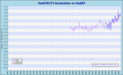
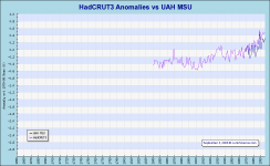
It is particularly noteworthy that the atmospheric records, both HadAT and UAH MSU, either meet or exceed the near-surface temperature spike evident in all records with the 1998 El Niño event. This interests us primarily because it effectively destroys claims of atmospheric "temperature lag" that have been raised to explain the atmosphere's lack of response to hypothesized enhanced greenhouse-forced warming. Additionally, the exaggerated response suggests the atmosphere is actually hyper responsive to global temperature change with the surface El Niño event causing dramatic and near-immediate atmospheric warming -- to a significantly greater extent than experienced at the surface -- then cooling to near "normal" with the passing of the event. Mindful that enhanced greenhouse theory postulates atmospheric warming should occur at roughly 1.3 times the rate experienced at the surface and noting that the atmospheric records do indeed indicate a much more significant jump in temperature in response to the El Niño event than do any of the near-surface records (even the overblown GISTEMP) indicates that the atmosphere is alive and well and reacting more or less as predicted but also that the near surface records are as yet doing a poor job of handling urbanization (i.e., demonstrating UHI to a much greater extent than enhanced greenhouse warming).
Is there something wrong with the hypothesis that the atmosphere recorded not just 1.3 times but double the transient increase shown at surface? Probably not. In our opinion -- and it is only an opinion without proof -- the near-surface amalgams are currently too corrupted by UHI to adequately reflect the El Niño-generated warming pulse demonstrated in the atmospheric records. Now we come to the "hottest" of records:
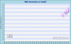
Finally, we come to our sadly short atmospheric records compared. Rather like HadCRUT3 and NCDC, these two are slightly offset but in lockstep. Unlike HadCRUT3 and NCDC, these two are derived by completely independent means. Where the near-surface temperature amalgams all rely on the same set of recording stations using roughly similar equipment and techniques, from which they select their favorite subsets of records upon which they perform their own particular rituals, the atmospheric datasets are derived utilizing entirely different equipment and employing unique techniques.
Where near-surface amalgams all utilizing the same data could be equally right -- or wrong -- there is no independent check, it's merely a case of hazarding a guess as to how right -- or wrong -- they might be. Where temperature is under consideration it is doubly "a matter of degree". On the other hand, unlike our maybe, maybe not near-surface amalgams, the distinct instruments and techniques of our atmospheric datasets provide mutual validation by independent discovery. In science such cross validation is usually considered quite compelling.
The highly reactive nature of the atmosphere and the near-immediate response to the 1997-98 El Niño event captured by the atmospheric datasets suggests the atmosphere really does respond to warming as predicted (greater than the surface) and that the enhanced greenhouse-forcing from increased atmospheric carbon dioxide really is as trivial as calculated by Lindzen, Pielke and others.
We hope our efforts at standardization have helped you to navigate the extraordinary "fruit salad" of global mean temperature datasets but, be warned, it will not be long before someone has a bright idea for a new grant or paper and we'll need to scramble to navigate the maze and untangle the seemingly incomprehensible yet again. This must be fun because we keep on doing it but is does take time, effort and funds, so, if you can, please be generous. Your financial support helps stop zealots driving us back to the dark age.
Suggested additional reading:
HOMECopyright © 2006 JunkScience.com - All Rights Reserved
|